
Why Is Your Mobile User Experience Driving Your Customers Away? The Solution
- JB Impact

- Jul 9, 2025
- 11 min read

Mobile user experience determines the success or failure of your digital presence today. With over 50% of global internet traffic generated by mobile devices[8], your site absolutely must be optimized for smartphones. Otherwise, you're losing potential customers every day.
The numbers speak for themselves: 70% of online searches will now be done on mobile by 2024, compared to only 30% on desktop[8]. This trend is accelerating with an 80% increase in app downloads since 2016[8]. You should know that a site that loads in more than 4 seconds immediately loses 25% of its visitors[8]. A poor mobile experience is no longer just an inconvenience - it's a direct brake on your growth.
We see the damage caused by poorly designed mobile user experiences every day. Businesses invest heavily in their websites without understanding the specifics of the mobile experience, leading to catastrophic bounce rates and plummeting conversions. In 2023, Canadians spent a record US$2.87 trillion on mobile apps, representing more than 34% of the national e-commerce market[8].
We'll reveal why your mobile user experience is driving customers away and, more importantly, how to effectively fix it. You'll discover the most common mistakes, specific mobile user behaviors, and concrete strategies for creating an optimized user experience that actually converts.
Why Mobile User Experience is Crucial Today

Image Source: Toptal
Smartphones now dominate our daily interactions, making mobile user experience essential for any business aiming for online growth.
The evolution of digital uses
Mobile device usage has exploded in recent years. Consumers now favor their smartphones over their computers. More than 85% of the French population owns a smartphone , compared to 41% ten years ago. This spectacular growth has completely transformed our browsing habits.
Mobile screen time reaches 3.5 hours per day for 18- to 34-year-olds. Mobile apps account for nearly 70% of the total time spent on digital devices. This dominance is explained by the constant accessibility of smartphones, which are accessed an average of 58 times per day.
This shift in digital usage directly impacts interactions between users and brands. A website user experience that isn't optimized for mobile means disappearing from your target market.
Mobile-first: an SEO and UX requirement
Google officially adopted mobile-first indexing in 2018, primarily using the mobile version of sites to index and rank pages. This decision redefined the SEO strategy of all online businesses.
Today, a site that isn't optimized for mobile suffers penalties in search results, regardless of the quality of its content. Criteria such as mobile loading speed, touch navigation, and adaptability to small screens have become determining ranking factors.
The "mobile-first" approach to designing an optimized user experience forces us to focus on what matters most. This creative constraint requires us to prioritize information and simplify user journeys, ultimately benefiting the overall UX , including desktop.
Differences between mobile and desktop UX
The mobile application user experience differs radically from that on a computer, both in user behavior and technical constraints:
Usage context : Mobile users often browse on the go, distracted or in a hurry, while desktop users operate in a controlled environment with more time available.
Touch interactions : Finger navigation replaces mouse precision, requiring enlarged click areas and adapted interactions (swipe, pinch, etc.).
Screen size : Limited space requires prioritizing information and creating sequential paths rather than displaying everything simultaneously.
Technical performance : Mobile connections can be unstable and devices less powerful, making loading speed even more critical.
A poor mobile user experience immediately generates high bounce rates. 53% of mobile visitors abandon a site that takes longer than 3 seconds to load.
The main mistake businesses make is simply adapting their desktop site to mobile, instead of completely rethinking user experience design for mobile specifics. This approach overlooks fundamental differences in context and interaction, creating a frustrating experience that drives away potential customers.
Mistakes That Kill Your Mobile User Experience
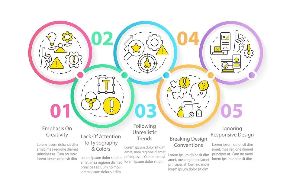
Image Source: Vecteezy
Despite the clear importance of mobile, we still see too many businesses making fundamental mistakes that sabotage their online success. These obstacles create a poor user experience and drive away your potential customers.
Catastrophic loading time
Your mobile visitors don't wait. 53% of visitors abandon a site that takes more than 3 seconds to load. Every extra second costs you 7% in conversions.
Common culprits include:
Unoptimized images that slow down loading
Unnecessary scripts and plugins that weigh down your site
Lack of efficient caching
Servers not suitable for mobile traffic
Speed directly impacts your user experience (UX) and your Google ranking. A slow site suffers a double penalty: reduced visibility and lost conversions.
Chaotic navigation on a small screen
We constantly see websites stupidly duplicating their desktop menu on mobile. This approach creates cluttered navigation that's incomprehensible on smartphones.
The "hamburger menu" can also hinder your accessibility. While it saves space, it reduces the visibility of navigation options by an average of 25%. Mobile users prefer fixed navigation bars that are accessible while scrolling.
Design unsuitable for tactile interactions
Poor user experience design is immediately recognizable: tiny text that requires zooming, buttons that are too small and difficult to touch, and endless forms on mobile.
42% of users abandon sites that require them to constantly zoom in and out to read content. This visual fatigue leads to high bounce rates. You need to prioritize your content differently on mobile, prioritizing essential information.
Poorly controlled tactile interactions
The mobile experience relies on intuitive touch interactions. Yet, many sites ignore mobile usability standards, such as the minimum size of 44x44 pixels for touch areas.
Typical mistakes include links that are too close together, causing unwanted clicks, or interactive elements placed in areas that are difficult for the thumb to reach. 75% of users navigate primarily with their thumb, making the upper areas of the screen problematic.
Touch gestures (swipe, pinch, etc.) are often misused or poorly signaled, creating confusion for the user who doesn't know how to interact with your interface. A successful mobile experience must rely on familiar and clearly identifiable interaction patterns.
Decoding Mobile Behaviors: What Your Customers Really Expect

Image Source: Userpilot
Your customers' mobile usage habits differ radically from their desktop usage habits. This directly influences their expectations and patience with your site. Mastering these specific behaviors allows you to create an interface that meets the real needs of your users.
Short Sessions and Fragmented Attention
Smartphone sessions last 50% less than desktop sessions [1]. This difference is explained by the fragmented usage context of mobile devices. Your customers check their smartphones up to 150 times a day [2], creating micro-interactions characterized by limited attention.
Mobile multitasking is the norm for 95% of the population [2]. Your users are constantly switching between apps and websites. This habit generates a significant cognitive cost: the brain actually processes tasks sequentially, not simultaneously [3]. Divided attention therefore reduces your visitors' ability to concentrate and patience.
Navigation in Motion: A Constant Challenge
Your mobile users are often browsing on the go, creating unique challenges for your interface. Think With Google reveals that 61% of users immediately leave a mobile site if they can't find what they're looking for [4]. This impatience is explained by the varied contexts: transportation, waiting, moving.
Mobile navigation is primarily thumb-based [5], imposing significant physical constraints. Crucial actions must be located in easily accessible areas, generally at the bottom of the screen. An optimized user experience necessarily incorporates this physiological reality.
Simplicity and Speed: The New Imperatives
Mobile patience is eroding every year. Today, 59% of users demand loading in less than 3 seconds [6], while 71% want speed equal to or greater than that of their desktop computer [6].
Your mobile customers prefer clean interfaces that allow them to quickly find the information they are looking for [7]. An effective user experience design must therefore:
Clearly prioritize information to reduce cognitive load
Provide smooth navigation adapted to touch interactions
Remove unnecessary decorative elements from the desktop
Provide clear content that makes it easier to read on a small screen
Mobile behavior demands an approach focused on immediate effectiveness. To avoid a poor user experience , you need to understand that your mobile users are looking for fast, seamless experiences that are perfectly tailored to their specific usage context. This understanding forms the basis of a mobile strategy that truly converts.
How to Optimize Your Mobile User Experience
To create a successful mobile user experience, you need to go beyond superficial tweaks. Here are concrete strategies that will transform the way you interact with your website or app.
Adopt a responsive or mobile-first design
The mobile-first approach involves designing for small screens first before enriching the desktop experience. This method ensures that your website user experience remains seamless across all devices. Unlike the traditional responsive approach, which adapts desktop content to mobile, mobile-first forces you to prioritize essential elements from the design stage.
We recommend using flexible grids and relative units (%, em, vh) rather than fixed pixels to ensure a perfect fit for all screen formats.
Optimize Calls to Action (CTAs)
CTAs represent your crucial conversion points. For a successful mobile app user experience:
Place the buttons in the thumb-accessible area (bottom of the screen)
Size them sufficiently (minimum 44×44 pixels)
Use strong contrasts to draw attention
Choose short, active labels (“Order” rather than “Order”)
Use native gestures (swipe, tap, pinch)
Integrating intuitive mobile gestures significantly improves user engagement. Interactions like swiping, pinching, and tapping align with users' natural habits on mobile. Favor galleries navigated by horizontal swipes or pinch-to-zoom options instead of traditional buttons.
Reduce cognitive load
The concept of cognitive load is central to user experience design. To reduce it:
Simplify forms by asking only for essential information
Break complex processes into clearly identified steps
Use auto-completion and real-time validation mechanisms
Remove unnecessary visual distractions that distract attention
Test with real users
The best way to avoid a poor user experience is to test your interface against real users. User testing often reveals problems that are impossible to identify otherwise. "Think aloud" tests, where the user verbalizes their thoughts while browsing, are particularly revealing.
Direct observation sessions also help identify points of friction and misunderstanding that affect the overall user experience.
Constantly measure and optimize your mobile UX

Image Source: VWO
Optimizing your mobile user experience requires a scientific approach based on hard data. Without accurate metrics, you're flying blind and risk making costly decisions based on assumptions.
Use heatmaps and analytics to analyze behaviors
Heatmaps reveal precisely how your users interact with your mobile interface. These heatmaps allow you to gain insights into the user experience by visualizing the most visited areas [8]. We recommend three essential types to optimize your website user experience :
Click heatmaps record where users tap on mobile, revealing the true effectiveness of your CTAs
Scroll heatmaps show how far visitors scroll, indicating whether your critical information is visible
Motion heatmaps track the cursor's path, revealing where attention is focused [8]
Heatmap analysis can drastically improve your conversion rates by identifying high-performing and low-performing areas of each page [8].
Implement A/B testing to optimize your conversions
A/B testing is a rigorous method for comparing two versions of a page or element. This approach allows you to make decisions based on evidence rather than hunches [9]. Here is our recommended process:
Clearly define the target metric (conversion rate, click-through rate)
Formulate a testable hypothesis about the intended improvement
Create two distinct variations with measurable differences
Ensure sufficient duration to obtain statistically significant results [9]
A/B testing reveals which elements of your user experience design generate the most impact, which ones need improvement, and which ones to abandon [10].
Collect qualitative user feedback
Mobile feedback represents one of the few solutions that has a direct impact on the mobile application user experience [11]. Beyond quantitative metrics such as Net Promoter Score or CSAT, feedback reveals the motivations behind user behavior [11].
There are three main methods for collecting this valuable feedback:
Via Webview by integrating a form into the interface
Via API to integrate feedback into your existing environment
With an SDK that displays forms based on user behavior [11]
Analyze multi-channel customer journeys
Multi-channel journey analysis helps map and interpret consumer interactions across multiple touchpoints [12]. This holistic view is essential for understanding how users navigate between your mobile site, app, and other channels.
For effective analysis, we implement key performance indicators (KPIs) such as conversion rate, average basket or abandonment rate [13]. Beyond the figures, we recommend listening to your customers' feedback and opinions to refine your understanding of their expectations [13].
Conclusion
Mobile user experience now determines the success or failure of your digital presence. Here are the key takeaways to turn your mobile visitors into loyal customers:
• Over 70% of searches are done on mobile - Optimize for smartphone first before desktop with a mobile-first approach
• 3 seconds maximum loading time - Beyond that, you lose 53% of your visitors and your conversions drop by 7% per additional second
• Radically simplify your interface - Mobile users have 50% shorter sessions and practice constant multitasking
• Adapt to touch interactions - Minimum 44x44 pixel buttons, thumb navigation, and integration of native gestures (swipe, tap, pinch)
• Continuously measure and adjust - Use heatmaps, A/B testing and user feedback to constantly optimize your mobile UX
• Prioritize reduced cognitive load – Eliminate distractions, fragment complex processes, and clearly prioritize information
A poor mobile experience no longer just frustrates your users—it directly compromises your Google rankings and revenue. Mobile optimization is no longer a nice-to-have; it's an absolute necessity to stay competitive in today's digital economy.
Mobile user experience determines the success or failure of your business in today's digital economy. We analyzed how consumer habits have evolved, placing smartphones at the heart of their purchasing decisions. This reality requires a mobile-first approach to your digital strategy.
The mistakes we've identified—excessive loading times, confusing navigation, design unsuited to small screens, and flawed touch interactions—can be corrected with the right strategies. A mobile-first approach represents the most important change to adopt now.
Your mobile strategy must adapt to specific user behaviors: short sessions, on-the-go use, and a desire for simplicity. These specificities require a complete rethink of information architecture and user journeys.
We integrate artificial intelligence to personalize the mobile experience at scale. Using predictive behavior analysis, these tools anticipate user needs and dynamically adapt the interface to maximize conversions.
Continuous measurement of UX performance remains essential. Heatmaps, A/B testing, and feedback collection will allow you to constantly refine your mobile experience and maintain your competitive edge.
Mobile user experience isn't just a technical aspect to optimize—it's a decisive competitive advantage. Companies that master this area benefit from greater visibility in search engines and increased customer loyalty. In a market where attention is becoming the most valuable resource, delivering a seamless and intuitive mobile experience is no longer optional—it's essential to your survival.
You now have the keys to correcting the mistakes that drive away your mobile customers and creating an experience that converts. The time to act is now.
FAQs
Q1. What is a good mobile user experience?
A good mobile user experience offers intuitive navigation, fast loading times (less than 3 seconds), a design adapted to small screens, and optimized touch interactions. It takes into account the mobile usage context and simplifies tasks for the user.
Q2. Why is mobile user experience so important today?
Mobile user experience is crucial because over 70% of online searches are now conducted on smartphones. A poor mobile experience can lead to high bounce rates, lower SEO, and lost leads. It directly impacts a company's visibility and revenue.
Q3. How can I improve the user experience of my mobile site?
To improve your mobile experience, adopt a mobile-first approach, optimize loading speed, simplify navigation, adapt the design to small screens, and use intuitive touch interactions. Test regularly with real users and analyze data for continuous adjustments.
Q4. What are some common mistakes in mobile UX?
Common mistakes include long loading times, confusing navigation, design not adapted to small screens, and poorly designed touch interactions. Ignoring the specifics of mobile behavior (short sessions, multitasking) is also a common mistake.
Q5. How do I measure the effectiveness of my mobile user experience?
Use tools like heatmaps to visualize interactions, run A/B tests to compare different versions, collect direct user feedback, and analyze multi-channel customer journeys. Key metrics include bounce rate, time on site, and mobile conversion rates.


Comments